
Storm Collaboration by Eleanor Pritchard
A guest post by Eleanor Pritchard celebrating the release of our recent textile collaboration. For more insight head over to eleanorpritchard.com
I enjoy working with like-minded creative businesses - kindred philosophical and aesthetic spirits. So I was excited to be approached by architecture studio Hyde + Hyde. Founded by creative and life partners Kay and Kristian Hyde, the practice is dynamic, ambitious and uncompromising in its approach.
Here is the extraordinary ‘House for a Photographer’. In Hyde + Hyde’s own words:
Pushing structure to its limit, with an extreme cantilever that reaches out to distant views like a camera obscura, House for a Photographer quietly defies gravity in an abandoned quarry on the edge of the Brecon Beacons National Park. The unique site demands an architectural intervention of elegant simplicity. Constructed from concrete and timber, a red oxidised steel-panelled facade effortlessly embeds the building into its surroundings and weathers with grace.

House for a Photographer

Silver House
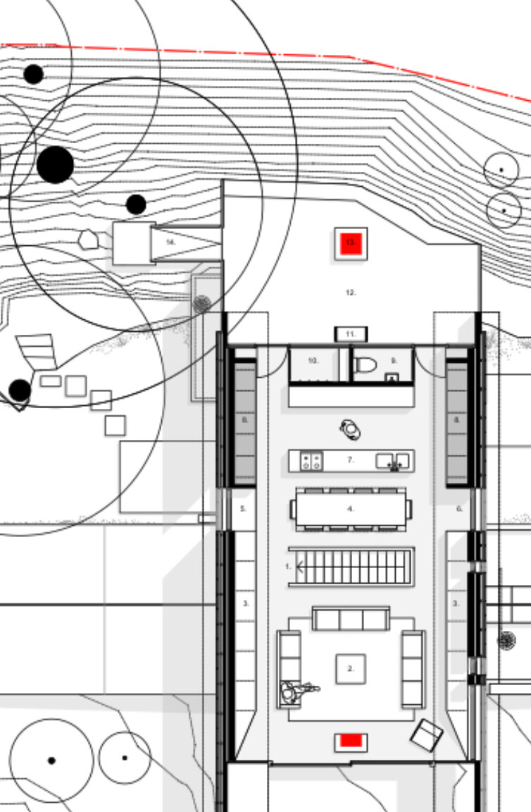
And above is Hyde + Hyde’s Silver House.
Silver House quietly fulfils the lifelong goals of our clients - to return home from the big city, live in peace and stretch out time among the ever-changing tides of the sea. Nestled on a hilltop on the Gower Peninsula, South Wales, Silver House celebrates sunny days and embellishes winter storms.
Hyde + Hyde were first introduced to our work via the blanket we made for Monocle Magazine a few years ago - seen here through a window in Silver House. The outcome of our extended dialogue and creative exchange is the Storm blanket.

Silver House

The composition is a large scale repeat of black bars which march threefold across the ground of the blanket. Underneath the bars run three wide bands of dotted texture - a subtle shaded effect created with an end-and-end warp. The muted ocean tones of the ground are lifted with a series of small white accent dots spaced in four lines across the span of the blanket.
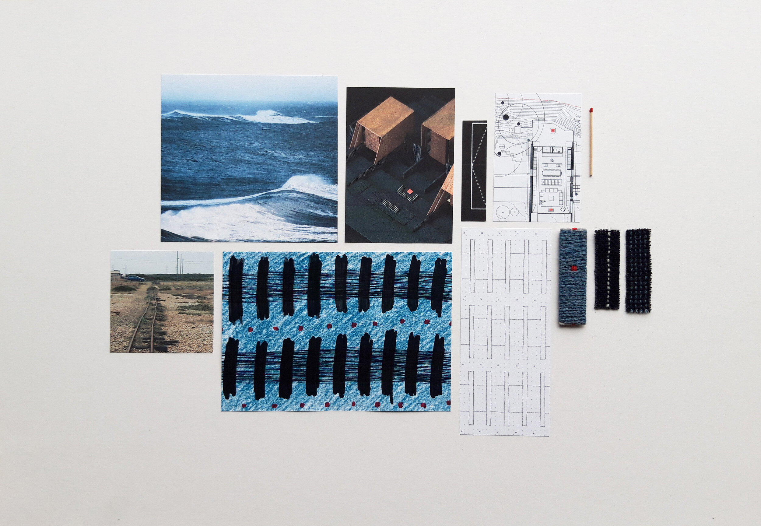
My initial storyboard above - with visual imagery incorporated from Hyde + Hyde - offers a little context to the narrative which underlays the design. Here you see my rough sketch of the black bars astride the dotted bands of texture - echoing disused railway sleepers on a shingle beach. In the final iteration of the design, the black bars taper to an off-centre spur, bringing a sense of movement and lightness to the composition.
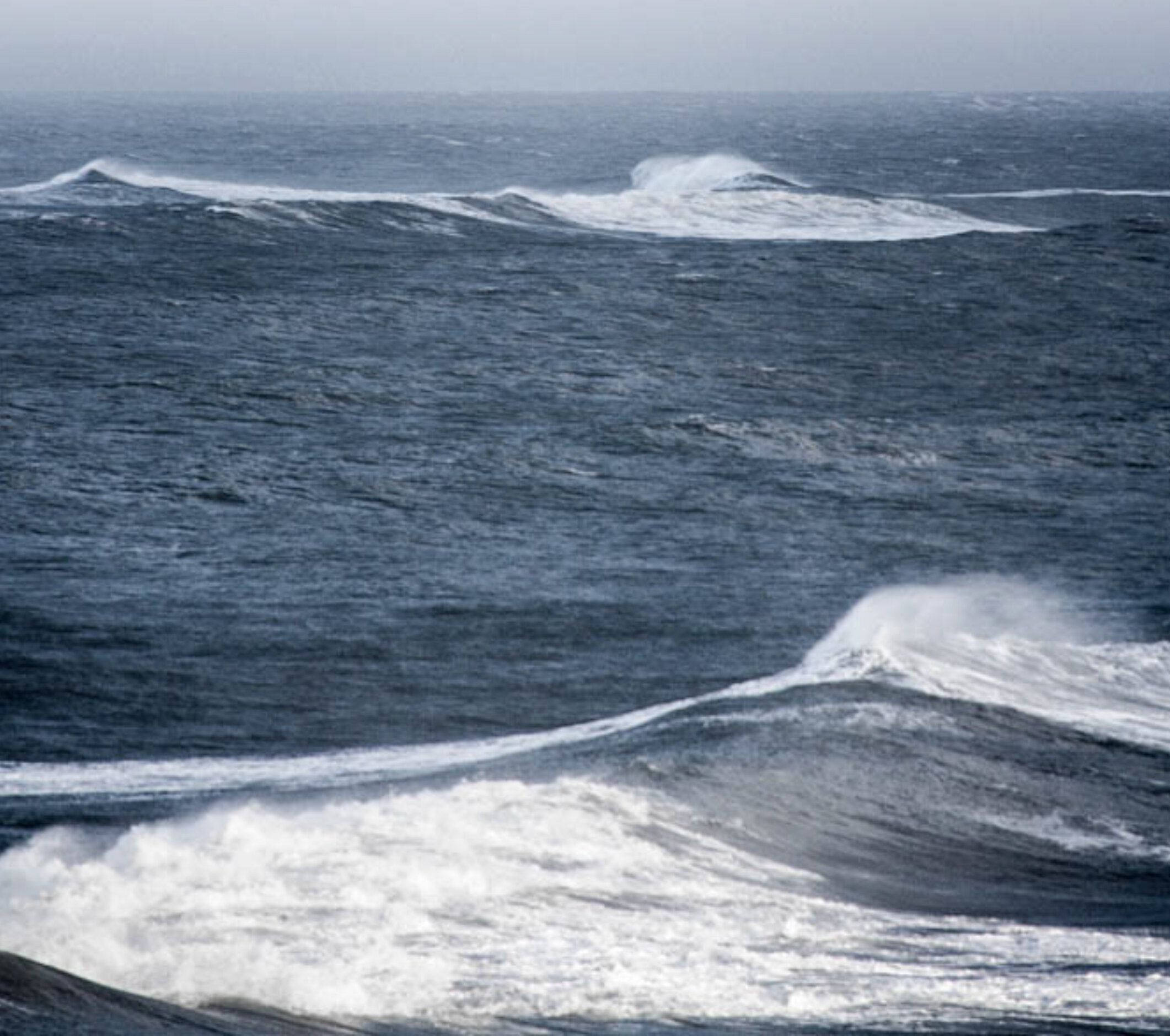
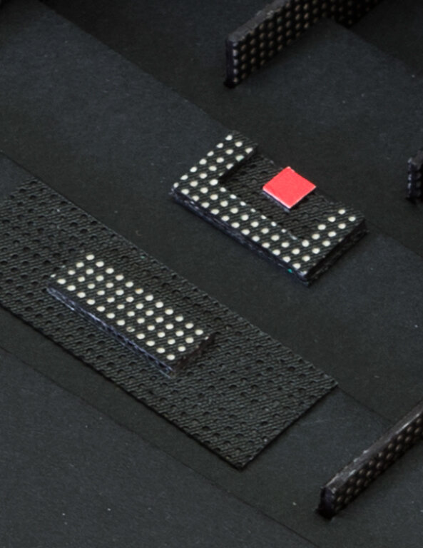
The palette for the Storm blanket draws closely on the Hyde + Hyde’s reference imagery (above) - the sea grey ground on the front face of the blankets draws on Kay and Kristian’s fascination with “the mystery of the ocean”, and the graphic use of black, white and red on the reverse face (seen below) references the graphic quality in their architectural drawings and models.
In Hyde + Hyde’s visual language, the red represents “…the importance of hearth or fire as an anchor point within their work, and the white singularity symbolises the search for precision”.

The blankets are woven on Dobcross shuttle looms at a small traditional family-owned mill in South West Wales - not far from Hyde + Hyde’s own practice.
And here below you see the full scale blanket - the outcome of this creative dialogue across disciplines.

To learn more about the blanket please see the link to our online shop here.
—